Optimising your pharmacy layout
In Retail & merchandising
Follow this topic
Bookmark
Record learning outcomes
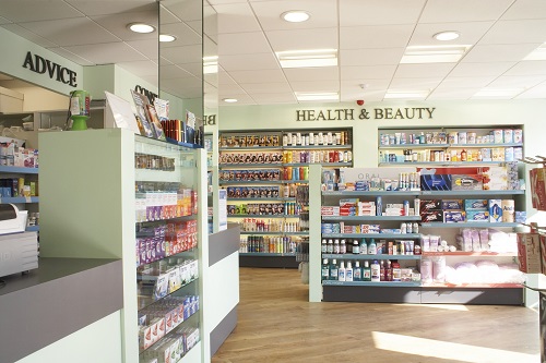
Getting the look and feel of your pharmacy right can be a difficult task. Reflecting the values of your overall business, it should be clean, tidy and welcoming.
Effective signposting is essential to ensuring your customers can find significant areas of the pharmacy such as the prescriptions counter, consultation room, promotional bays and product categories.
Ask the customer, be the customer
 The most important opinion about your pharmacy is the customer's, so why not ask their thoughts? Your customer will appreciate that you have asked their opinion and may offer you a new perspective of your pharmacy.
Put yourself in your customers' shoes and ask yourself:
- Does my pharmacy look inviting?
- What is the first thing I see as I enter, or even before I enter?
- Can I see the prescriptions counter from the doorway?
- What would be the typical route for a customer walking through my pharmacy?
- Can I make more of the route, encouraging customers to walk the shop floor before arriving at the prescriptions counter?
- Are product categories well signposted and can customers easily navigate my fixtures to get to the products they want?
Whilst outside your pharmacy, take a look at other people's reactions as they walk past. Have a think about what could make their heads turn.
Sleuth your competitors
If you find yourself at a blank with how to best layout your pharmacy, why not scout some of your local competitors?
When visiting your competitors, you should have a number of questions and thoughts in mind:
- Who is their target customer, and how are they enticed to shop in their pharmacy? Take a look at their windows, what can be seen, is it an intriguing visual? Does it look minimalist? Is it cluttered?
- Is the pharmacy easy to navigate and are you able to spot the fundamental features from the front entrance? Pharmacy counter? Consultation room? Waiting area? Are the product categories signposted well? Take a look and see if you can spot the natural path that the customer is influenced to take.
- What is their most prominent category and how can you tell that this is the case? Where is this category placed and how is it advertised to customers?
- Is this a place that exudes personality and encourages the customer to linger, taking in everything that is on offer? What gives off this impression?
- What catches your eye and what is it about the presentation that is compelling?
- The final, most important question to ask is what ideas can you take from this pharmacy to apply to your own business?
Taking ideas from others shouldn't stop with your direct competitors. We all need inspiration and you can get this from many different retailers.
Focus points for a fab pharmacy layout
Pharmacy exterior: The front of your pharmacy is your personal advert to potential customers which is why it is of the highest importance you hit the nail on the head with your design. It represents your brand and should reflect your overall business performance.
Prescriptions counter: This is a fundamental part of your business and should be visible from the front of your pharmacy for easy prescription collection.
Retail space: Your retail area should be spacious and visually appealing. It should be a pleasure to browse with great products, well merchandised.
Security: Ensure minimal disruption to your service and profitability. If you can see all of your product fixtures from the dispensary, you are able to monitor your displays and reduce theft. Try not to display products too close to the door, and where areas aren't visible from the prescriptions counter, use mirrors to help with visibility.
Promotional material: Try to keep your promotional bays towards the front of the pharmacy so that customers can see your great offers through the window. Display promotional posters in the windows for customers to see the great offers you have from outside your pharmacy.
Consultation room: Locate in a quiet area of the pharmacy to avoid customers feeling uncomfortable with other customers crowding them whilst they are requesting a private consultation. Consultation rooms are an important part of independent pharmacy as they allow for services such as vaccinations, building a loyal customer base.
Waiting area: Should be located near to the dispensary so customers can easily hear when their prescription is ready. Face seating towards your shop floor or promotional material. Customers will subconsciously glance over to the area and may become interested in your retail offering whilst waiting. This is a perfect opportunity to encourage impulse purchases.
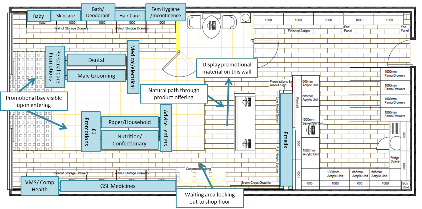
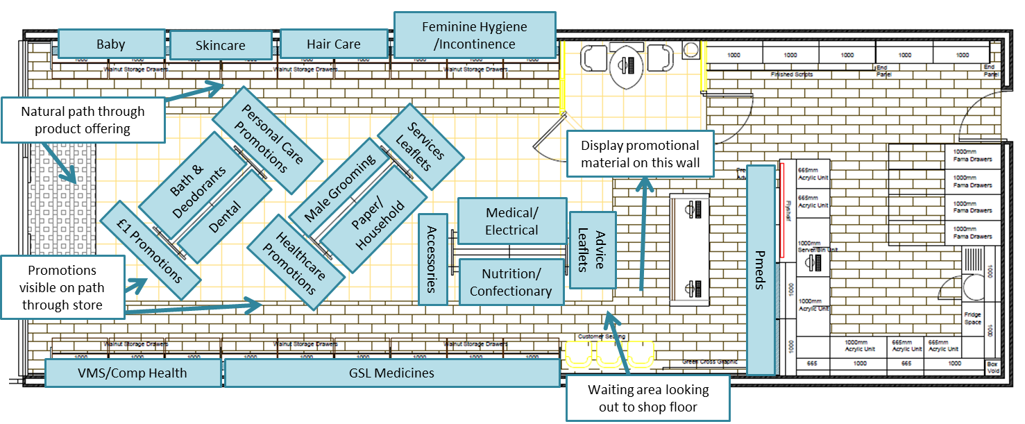
Below are two example pharmacy layouts which include category positioning and some pointers around why we think they excel at promoting pharmacy business.
Example store layout 1

Example store layout 2

By following these guidelines you can make your pharmacy a more professional and welcoming environment, which will encourage customers to return in the future.
