Windows are a vital part of a pharmacy's image alongside shop signage as it is the first impression a customer gets. Stand back from the front of the pharmacy, look at the windows and consider the following:
- Is there a key message? What is it, e.g. services offered or seasonal promotions?
- Are the windows clean and uncluttered?
- How many promotional messages are there?
- Can you see into the pharmacy?
- Is the service panel displayed and can it be seen clearly?
- Are there any outdated or irrelevant posters?
 If a passing customer cannot see into the pharmacy because the windows are dirty or cluttered they are likely to walk past as they will assume that the pharmacy will be the same inside. Less is more!
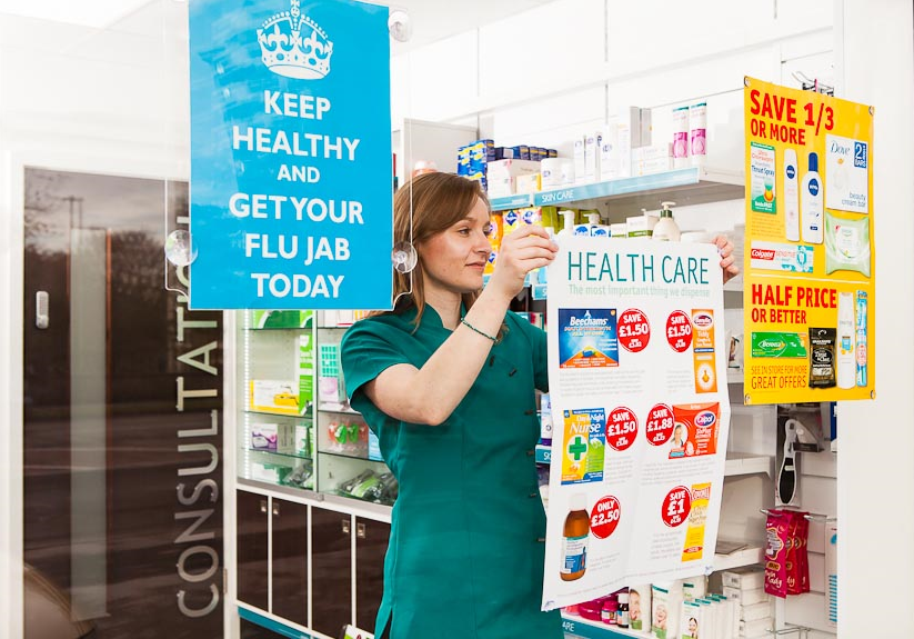
Depending on the size of the windows there should be no more than five pieces of promotional material, including posters, special offers and the service panel. Community pharmacies are often tempted to put 'local interest' posters in their windows.
This should be avoided wherever possible since it detracts from the overall image and message portrayed. If you want to support the local community consider having a separate notice board elsewhere, but only if you have an appropriate space. Remember you need to portray the image of a professional pharmacy and not a corner shop. The lights in the pharmacy should be switched on and there should be staff on the shop floor so that passers-by know your pharmacy is open for business and welcoming customers.